
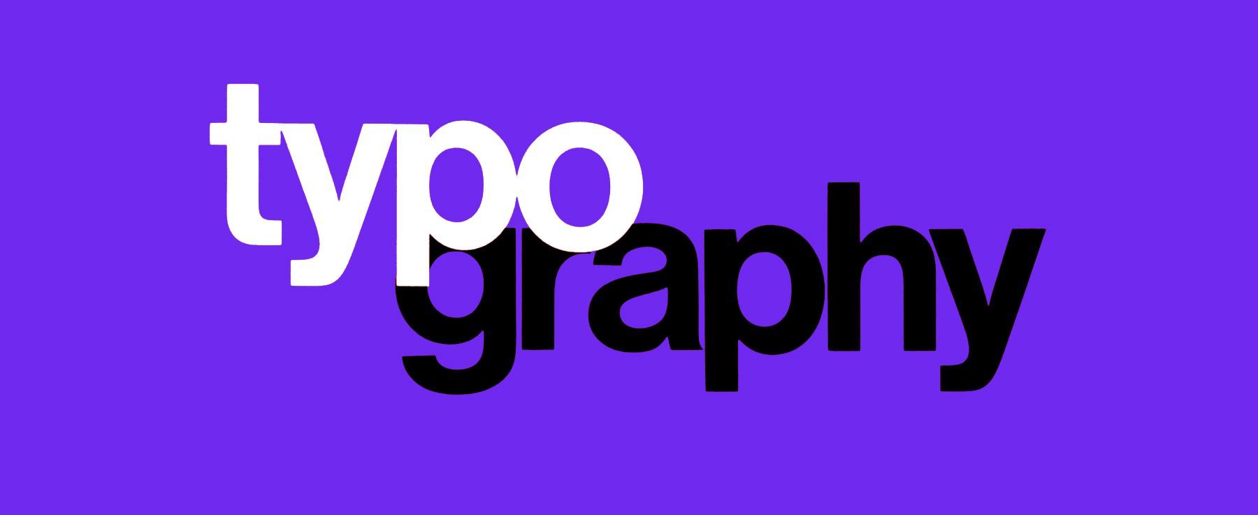
An essential part of the skill set of a web designer is typography design. A typeface can make or break a design based on how it fits your grid, layout, colors, and more. Fonts are crucial in web design; they are beyond legibility. It includes the lexicon used in that area of design, including the correct name for each part of a letterform and the arrangement of them within a design. There are so many terminologies. Here is a complete glossary of typography design terms and concepts for designers who are new to the field – or for those who want to refresh their memory.
Designing typography: key concepts
Selecting a font
It takes time and effort to design a font. Over decades, craftspeople have honed their skills and expertise to create typefaces. Font families with kerning pairs, multi-language support, and expressive alternate glyphs for dramatic differences in typeset are all features of professionally designed fonts. Each font family contains several weights and styles that form a complete family.
Sizing
There are different types of typefaces. A fat typeface is wider than a narrow typeface. As a result, the amount of space occupied by words set in different typefaces can be quite different.
Every character has an X-height that is measured by using the ‘x’s character (quite simply). In general, it’s best to use typefaces with similar X-heights when pairing them. Each character’s set width describes its own width. There is a space between each letterform and the rest of the letter body.
Leading
Each line of type has a leading between it. This method describes the separation of lines of type with strips of lead in the metal typesetting era. Generally, the leading value of body text should be 1.25 to 1.5 times larger than the font size to be legible and comfortable to read.
Kerning and tracking
An adjusting process that creates a harmonious pairing between characters is kenning. The top left of an uppercase ‘A’ sits above the bottom right of an uppercase ‘V’ where it meets an uppercase ‘V’.
Unlike tracking, kenning is similar to locating a vehicle. Each character in a word is spaced evenly by applying to track.
Measure
Text blocks are measured by their width. That is a vital consideration if you’re looking to make your readers have the best reading experience while navigating your web design. The length of your lines can make your reader lose their way, while a short line may break up the experience in an unwarranted way.
Scale and hierarchy
In a layout with all the types the same, it can be hard to tell which information is most important or where to begin. Web design uses size as one of the key ways to guide readers and create hierarchy. Body types are smaller than headers, subheadings are smaller, and headings are bigger. In addition to size, a designer can use color, spacing, and weight to define hierarchy.


Comments